Ohio State rallies to address Ohioans’ needs
We put our shared knowledge to work in communities around the state
Top stories
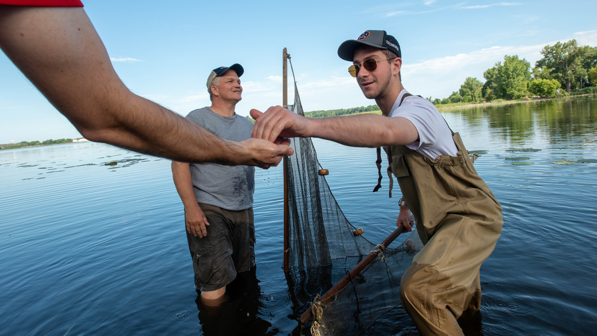
- 88OSU Extension Offices, one in every county
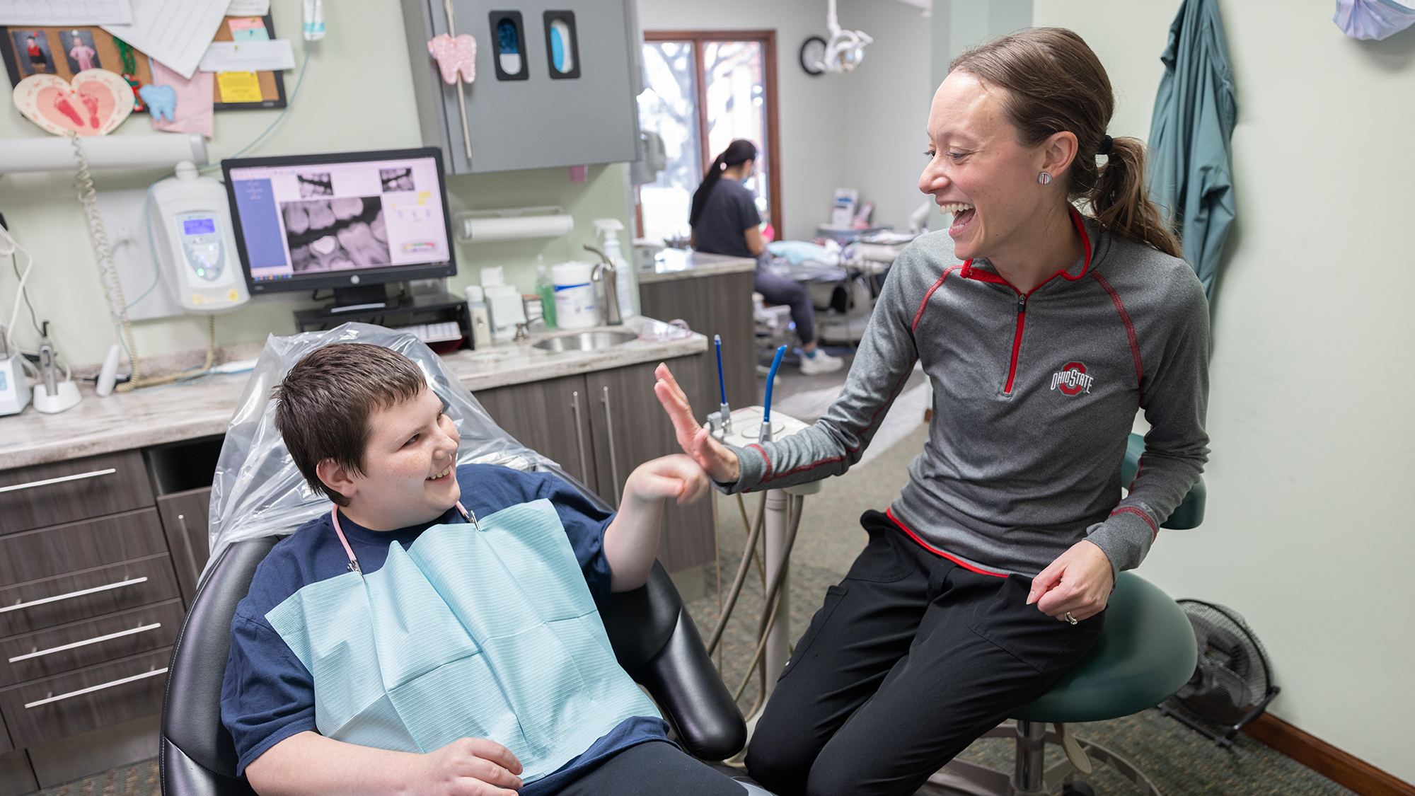
- 3.2MOutpatient visits to Ohio State
- $293MTax revenue generated for local governments
Most recent stories
- Creating a place where every child can play
A new inclusive playground in Noble County brings children of all abilities together, thanks to community collaboration and a mother’s vision for accessibility and belonging.
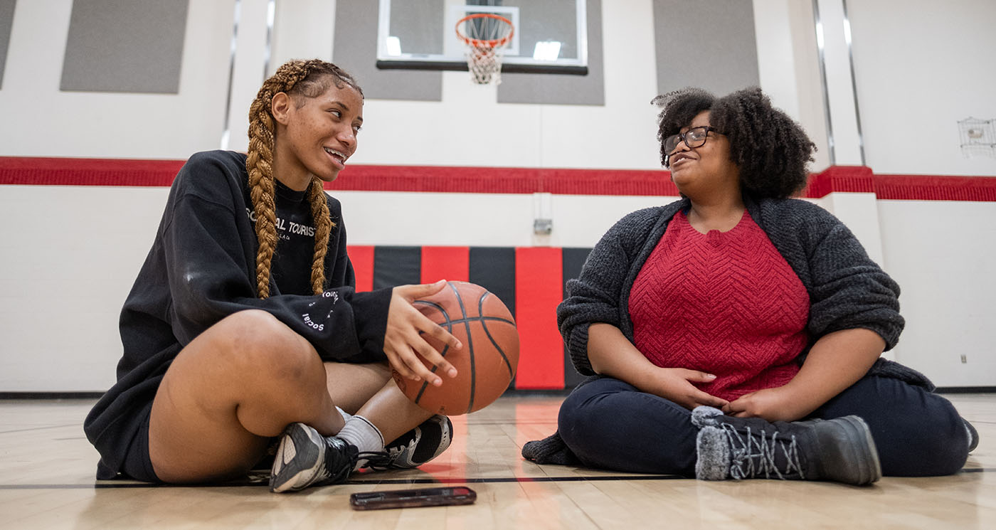
- Early screenings are unlocking young readers’ potential
With help from Ohio State, 9-year-old Harper found her voice and confidence in reading. Her journey shows the power of early dyslexia screening and advocacy.
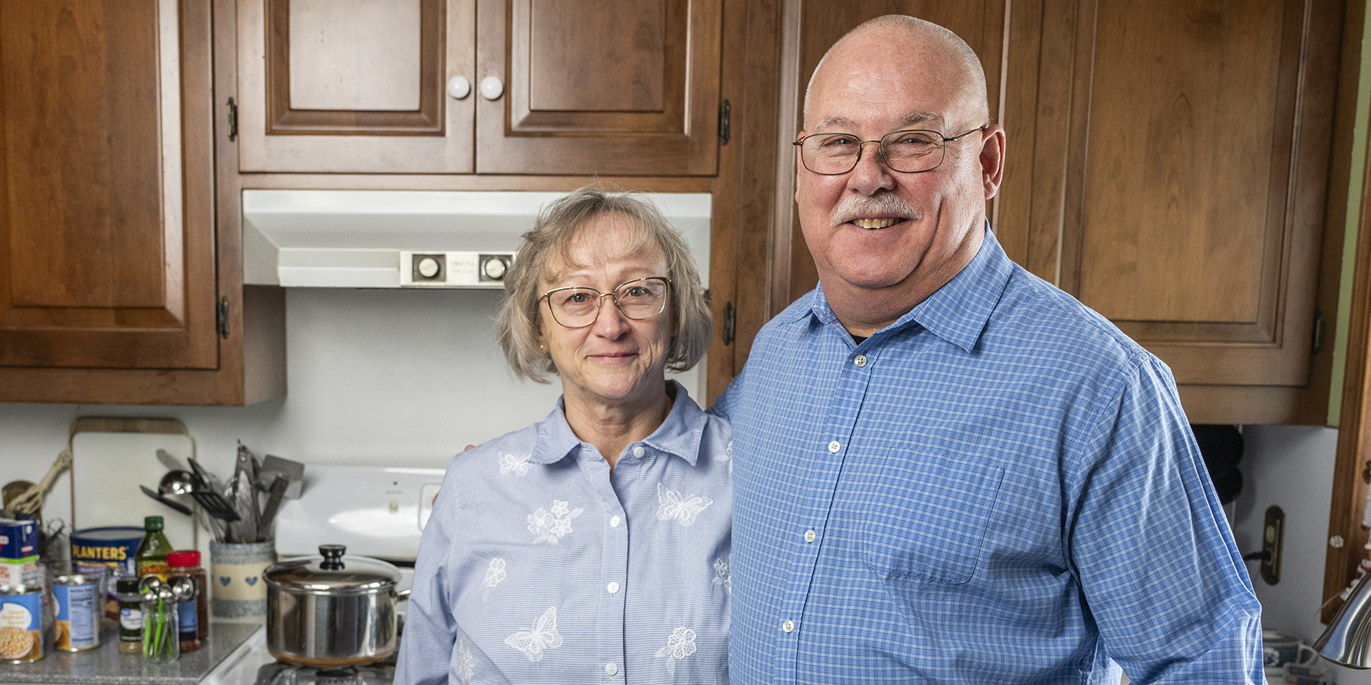
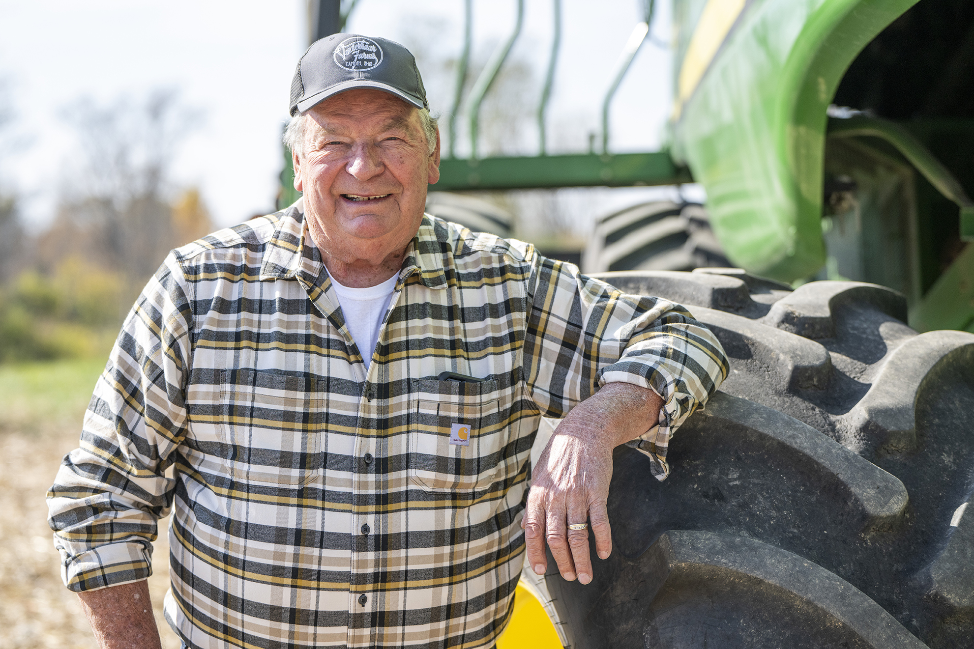
- Keeping Ohio’s experts in their fields
Ohio farmer Len Vonderhaar feared losing his passion due to health issues, but thanks to Ohio State’s AgrAbility program, he's still farming and contributing to his community.


How Ohio State impacts our state
Our connections with Ohioans and their communities run deep — across all 88 counties.
Choose a county
- 147,111Ohio State alumni in your community
- $39,214,519 Scholarships for students from your county
More Ohio State impact
The Ohio State University offers expertise on a variety of topics. Ohio State News delivers timely, trustworthy news to connect you to the university’s impact on your life, your community and your world.
Visit Ohio State News